

In this blog I want to analyse the design & color used in this tacoma advertisement. We will cover:
- contrast
- repetition
- alignment
- proximity
- color
Contrast

First we will start of with the big blue tacoma. The graphic designer make this brand new blue tacoma stand because of the nature background it is placed on. The bright blue tacoma sticks out like a sore thumb because of the use of contrast.
Let’s Also examine the highlighted writing. The graphic designer uses a white font color on the dark background to make it easy for viewers to read. This is an example of contrast.
Repetition
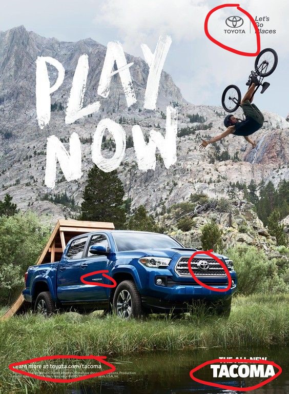
Repetition also plays a big role in the graphic design. The designer chooses to repetitively show both the Toyota and Tacoma emblem so that the view with remember the Toyota Tacoma ad.
Have seen an Ad for a car or truck and then suddenly you see it everywhere? That’s what repetition in Ads like this do.
Alignment

The alignment displayed by the red line the picture shows us the demonstration of appealing spacing and neat design. The alignment create tidy and professional design.
The alignment also creates the flow annotated by the blue line. As we noted before the big blue tacoma is the first thing you see because of contrast then the path follows the annotated blue line because of the the alignment.
Proximity

As we left of before the viewers eyes follow that blue line. After the viewer sees the big blue tacoma he sees the words “Play Now” and a bmx rider doing a stunt. Because of the proximity to the big blue tacoma, the viewer sees it next and associates the words “Play Now” and a bmx rider with tacoma.This a powerful technique! Now the viewer with associate these types of activities with the tacoma. This technique of proximity establishes association.
Color

The designer chose to use big blue tacoma on a green grassy background. This is intentional; the blue is main color and green is a perfect accent because it is a complimentary color on the color wheel. This make the design more appealing.
Conculsion
In conclusion, we can now state that the designer uses each design principle; contrast, repetition, alignment, proximity, & color; intentionally to make the designer more appealing and directed to the audience.

