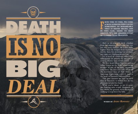
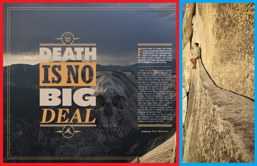
This magazine spread uses several different photography techniques such as Leading Lines, the Rule of Thirds, and Field of Depth. In addition, the designer uses intentional typefaces and contrasting typeface to create an exquisite design. Each of these techniques direct the eyes of the viewer, creates an aesthetically pleasing layout, and purposeful design. In the rest of this blog post I will analyze each of these techniques.
Leading Lines
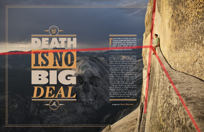
In the magazines spread the designer uses a photograph using the technique of Leading Lines.
“Leading lines refers to a technique of composition where the viewer of your photos attention is drawn to lines that lead to the main subject of the image.
A leading line paves an easy path for the eye to follow through different elements of a photo. Usually they start at the bottom of the frame and guide the eye upwards and inwards, from the foreground of the image to the background, typically leading toward the main subject.”
Anne McKinnell from digital-photography-school.com
This case we can see that the designer uses the edge of the cliff as one line, the face of the cliff as another, and the mountain ridge in the background as another. As you can see with my annotated red lines in the picture above. This a point to many focus Alex Holland the Pro climber featured in this article.
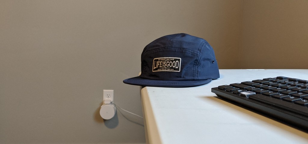
Below you can see that I have recreated this but instead used the on the table and keyboard to point the hat. This technique is simple! Almost anything can be used as a leading line. Such as a road, railroad, telephone line. Try it!
Rule of Thirds
Next, I want to talk about a technique both used in photography and typography. This technique is called the Rule of Thirds.
The rule of thirds is an essential photography technique. It can be applied to any subject to improve the composition and balance of your images…
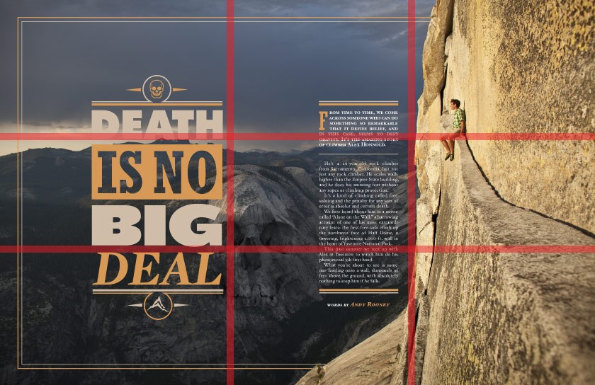
The rule of thirds involves mentally dividing up your image using 2 horizontal lines and 2 vertical lines, as shown below. You then position the important elements in your scene along those lines, or at the points where they meet…
The idea is that an off-centre composition is more pleasing to the eye and looks more natural than one where the subject is placed right in the middle of the frame. It also encourages you to make creative use of negative space, the empty areas around your subject.
Photographymad.com, Rule of Thirds
As you can see the photographer used the Rule of Thirds to position Alex Holland in the top right corner to create negative space and focus on Alex. This makes Alex the subject of the picture, creates balance, and excellent layout composition. Using this rule will improve the balance, composition, and focus in your designs. The see that designer has also placed the text in columns of thirds to create a composed design.
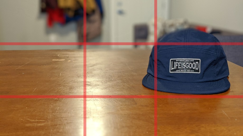
Below you can see that I have applied the same technique to the photo of my hat. I use the rule of thirds to place the patch of the hat in the far right center position. This creates negative space and a more interesting photo.
Depth of Field
In this next photography technique is Depth of Field. This technique is created by using focus and contrasting colors.
A basic definition of depth of field is: the zone of acceptable sharpness within a photo that will appear in focus. In every picture there is a certain area of your image in front of, and behind the subject that will appear in focus.
This zone will vary from photo to photo. Some images may have very small zones of focus which are called shallow depth of field.
“Understanding Depth of Field for Beginners” by Bruce Wunderlich, Digital-photography-school.com
To control the depth of field you need to your aperture and focal length. (to get more info see the article reference above.)
As you can see in the magazine spread above the photographer brought Alex Holland into focus because he is the subject. The photographer also makes the background mountain ridge dark and makes the cliff light to create shadows and highlights. Leaving the mountain in the shadows and the cliff in the highlights; this brings the focus onto Alex.
Below you can see that I have recreated this same effect by blurring out the background so that the hat is in focus.

Typefaces

The designer is very intentionally with his typefaces in magazine spread. He uses a big bold font for the title “Death is No Big Deal ” to draw the reader’s attention. Then the leading lines lead to the subject Alex Holland and then to the small article in the blue block.
In seconds the designer has announced his title, identified the subject and the reader has started the article. This perfect example of using design and typefacess combined to direct the reader’s eyes.
Contrasting Typefaces
In addition the designer uses contrasting typefaces to indicate to the use that the big bold sans serifs font as the title and the small serifs as the article.
Conclusion
We can conclude that designers and photographers are very intentional in their technique. The photographer uses Depth of Field, Leading Lines, and the Rule of Thirds to draw attention to the subject, Alex Holland. The photographer uses the shadows of the mountains and the highlights of the cliff in addition to aperture and focal length to create Depth of Field. He uses leading lines & rule thirds to point to and focus on Alex. The designer captures the the Rule of Thirds by implementing his text into two of the three columns. In addition, he uses purposeful fonts to direct the reader’s eyes and establish the title and article. Each of these techniques are used intentionally to direct the reader’s eyes, establish focus and create the subject.

