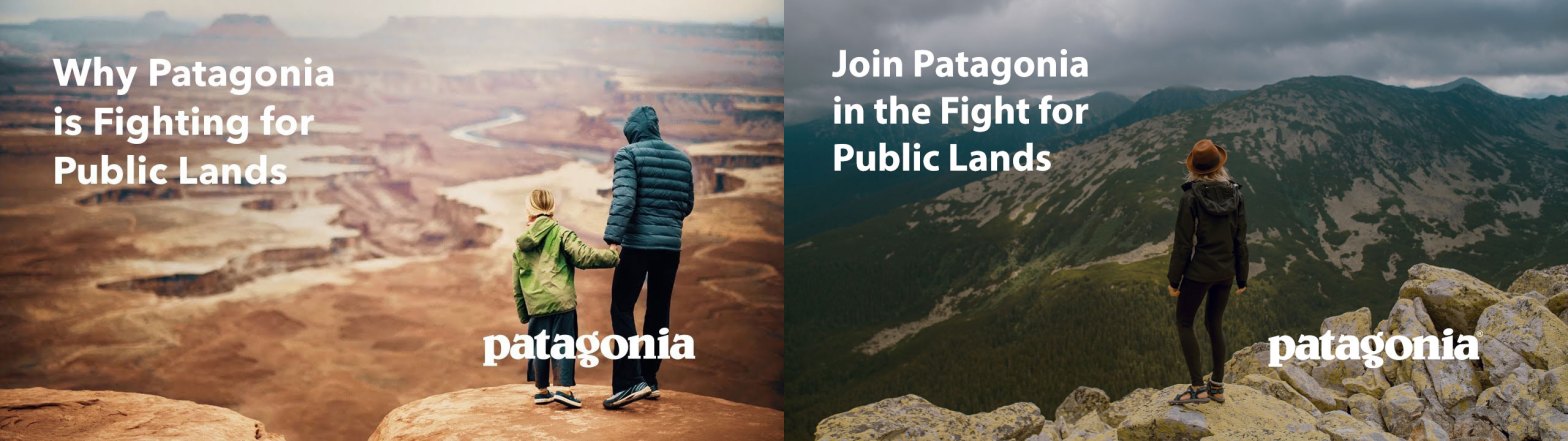
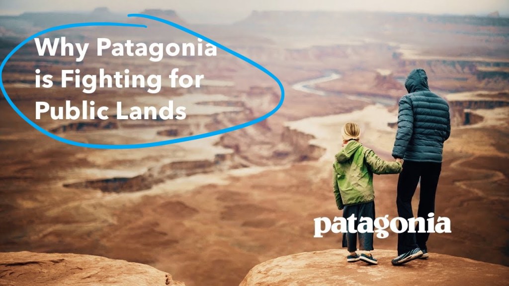
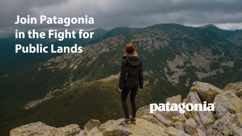
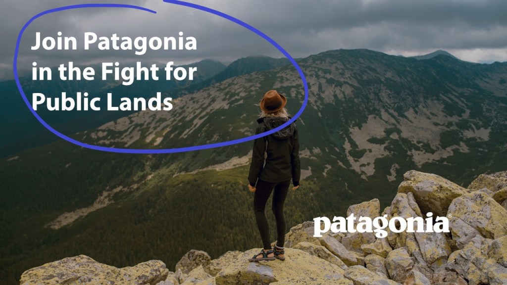
This article will be about comparing two ads, an original and a reproduction. The original ad was put out by Patagonia to promote supporting and donating to public lands. My new ad will be a fake companion ad to this ad campaign. I used some clips from Unsplash, copied Patagonia’s logo, and tried to match the font as closely as possible. This article will go over what process I went through to make my ad look like it was part of the original ad campaign. In this ad I will also go over four design principles, color and typography for each of the ads. In the first section I will talk about the design choices Patagonia made in the original ad and in the second section I will analyze how I mocked each of their design choices to make my ad seem like it was part of the same campaign.
Part 1: Original AD Analysis
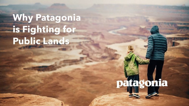
Design
Design: Contrast
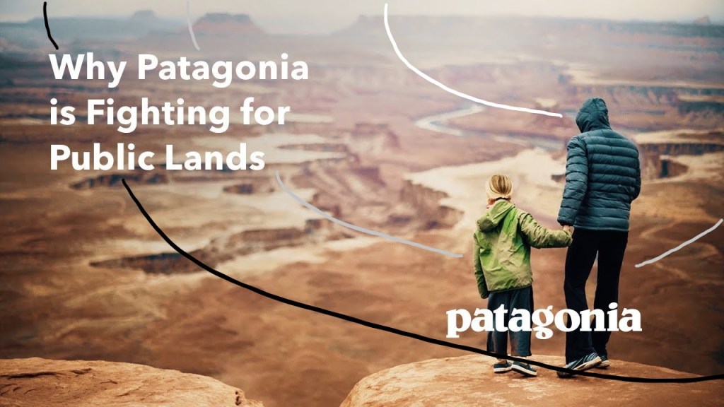
The first design principle I want to talk about is contrast as you can see in the original ad and Patagonia decided to use a filter over the top of the background image to add contrast; it’s very subtle but if you look closely you’ll notice it. The annotation in the picture depict this using the white line to depict the lightest part of the gradient to the grey to the black representing the darkest part gradient. This contrast allows the white texts to be more readable on the background image.
Design: Repetition
The second principle design is repetition. Neither of these ads use a lot of repetition, but they are very consistent. Consistent color scheme and font size.
Design: Alignment
This ad uses excellent alignment. It aligns both the text and the logo to opposite corners to create space,such as proximity and margins, to keep things looking neat.
Design: Proximity
As I said before this, I create space by the logo and text in opposite corners. This design makes it look clean and simple. In addition, it creates margins on both sides around the text and logo. This makes the focal point the ad the image rather than the logo and text.
Color
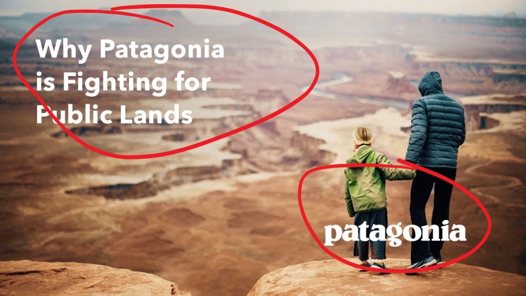
The focus of this ad is the image but to make the color of the font pop it added a filter to make the text readable. In addition, they made the color of the text and Logo both white so that it was consistent throughout the entire design.
Typography
In this design Patagonia used a simple Myriad Pro font so that text was bold and readable in contrast to the image. Using a simple bold font is very important when layering it over an image because the background is so busy the text needs to be very simple, bold, and readable.
Part 2: New AD Analysis
Design
Design: Contrast
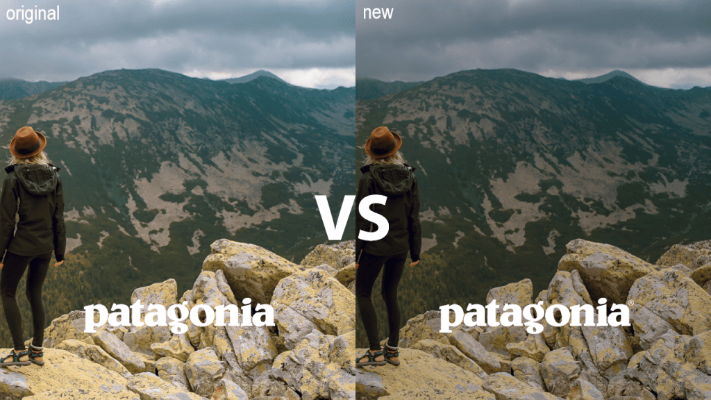
In the new ad to create contrast had to add a black layer with a very low opacity to make the image darker so that the text would be more readable. I felt like it didn’t take from the image because it made the sky seem like a dark overcast. In comparison to the original ad they added a more gradient layer to add contrast. However, in the new ad using a solid black layer went with the theme of the background image the best.
Design: Repetition
Just as the old ad did not have much repetition in it my ad didn’t either. But just as the old ad my fonts had a consistent white color.
Design: Alignment
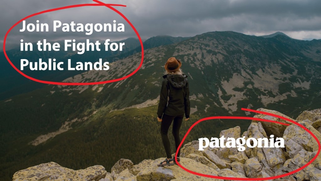
Just as the old I did my ad pulled both the text and logo to opposite corners to create proximity and alignment to opposite sides.
Design: Proximity
Just as the old ad did, I spaced my text and Logo exactly the same. I use the X & Y coordinates in Photoshop to position the logo and the text in the exact same position as the original ad.
Huge component of is the image as the focal point. The proximity and alignment of the text and logo make the supporting objects to the image rather than the focus.
Color
Color choice was pretty easy because the original design only used white for the text and logo.
Typography
The text was really easy to mimic as well because the Patagonia used Myriad Pro (Photoshop’s default font) or a font very similar. To get the sizing just right I used photoshop and created a text layer over the top of the top with the new text to match the size, line spacing, and font.
Conclusion
Patagonia has a design that is very simple and easy to mimic. The simple design of Patagonia’s ad design is to put emphasis on the photo rather than the text and the logo. Patagonia is an Outdoor Company and therefore the photo emphasizes people being outdoors. Then the heading put emphasis on Patagonia supporting public lands; narrowing the focus of the ad. Overall this is great simple design. Patagonia’s design is great example of use of contrast, proximity and alignment. As I mimicked Patagonia’s design principles, I was able to create an ad that looked a part of the original ad campaign.

