In this blog I want to analyse the design & color used in this tacoma advertisement. We will cover:
contrast
repetition
alignment
proximity
color
Contrast
First we will start of with the big blue tacoma. The graphic designer make this brand new blue tacoma stand because of the nature background it is placed on. The bright blue tacoma sticks out like a sore thumb because of the use of contrast.
Let’s Also examine the highlighted writing. The graphic designer uses a white font color on the dark background to make it easy for viewers to read. This is an example of contrast.
Repetition
Repetition also plays a big role in the graphic design. The designer chooses to repetitively show both the Toyota and Tacoma emblem so that the view with remember the Toyota Tacoma ad.
Have seen an Ad for a car or truck and then suddenly you see it everywhere? That’s what repetition in Ads like this do.
Alignment
The alignment displayed by the red line the picture shows us the demonstration of appealing spacing and neat design. The alignment create tidy and professional design.
The alignment also creates the flow annotated by the blue line. As we noted before the big blue tacoma is the first thing you see because of contrast then the path follows the annotated blue line because of the the alignment.
Proximity
As we left of before the viewers eyes follow that blue line. After the viewer sees the big blue tacoma he sees the words “Play Now” and a bmx rider doing a stunt. Because of the proximity to the big blue tacoma, the viewer sees it next and associates the words “Play Now” and a bmx rider with tacoma.This a powerful technique! Now the viewer with associate these types of activities with the tacoma. This technique of proximity establishes association.
Color
The designer chose to use big blue tacoma on a green grassy background. This is intentional; the blue is main color and green is a perfect accent because it is a complimentary color on the color wheel. This make the design more appealing.
Conculsion
In conclusion, we can now state that the designer uses each design principle; contrast, repetition, alignment, proximity, & color; intentionally to make the designer more appealing and directed to the audience.
This article will be about comparing two ads, an original and a reproduction. The original ad was put out by Patagonia to promote supporting and donating to public lands. My new ad will be a fake companion ad to this ad campaign. I used some clips from Unsplash, copied Patagonia’s logo, and tried to match the font as closely as possible. This article will go over what process I went through to make my ad look like it was part of the original ad campaign. In this ad I will also go over four design principles, color and typography for each of the ads. In the first section I will talk about the design choices Patagonia made in the original ad and in the second section I will analyze how I mocked each of their design choices to make my ad seem like it was part of the same campaign.
Part 1: Original AD Analysis
Design
Design: Contrast
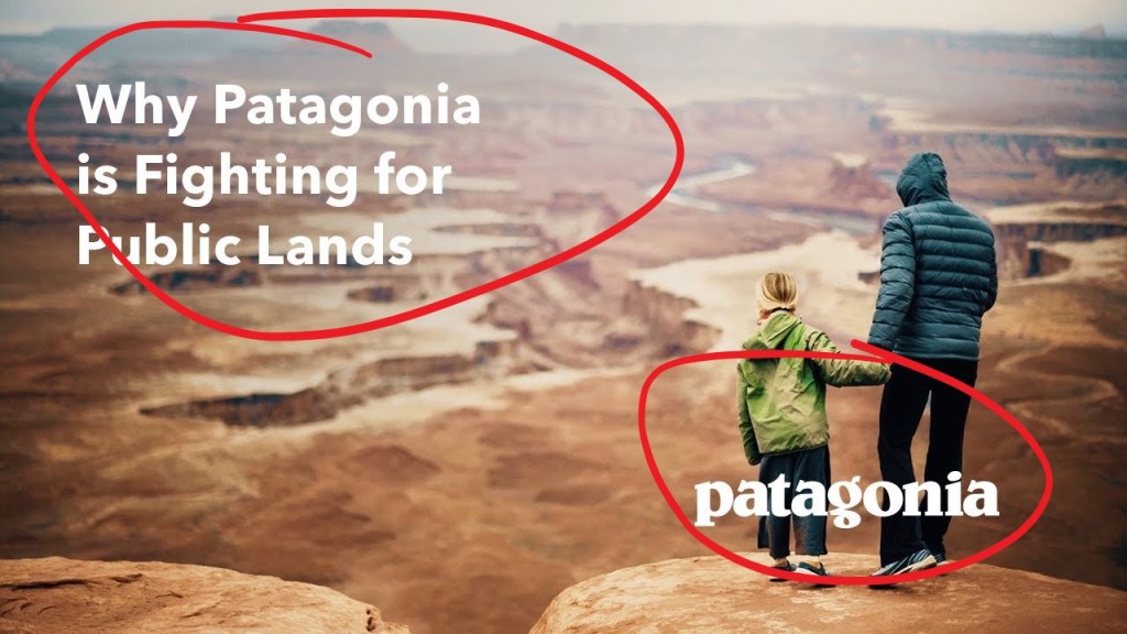
The first design principle I want to talk about is contrast as you can see in the original ad and Patagonia decided to use a filter over the top of the background image to add contrast; it’s very subtle but if you look closely you’ll notice it. The annotation in the picture depict this using the white line to depict the lightest part of the gradient to the grey to the black representing the darkest part gradient. This contrast allows the white texts to be more readable on the background image.
Design: Repetition
The second principle design is repetition. Neither of these ads use a lot of repetition, but they are very consistent. Consistent color scheme and font size.
Design: Alignment
This ad uses excellent alignment. It aligns both the text and the logo to opposite corners to create space,such as proximity and margins, to keep things looking neat.
Design: Proximity
As I said before this, I create space by the logo and text in opposite corners. This design makes it look clean and simple. In addition, it creates margins on both sides around the text and logo. This makes the focal point the ad the image rather than the logo and text.
Color
The focus of this ad is the image but to make the color of the font pop it added a filter to make the text readable. In addition, they made the color of the text and Logo both white so that it was consistent throughout the entire design.
Typography
In this design Patagonia used a simple Myriad Pro font so that text was bold and readable in contrast to the image. Using a simple bold font is very important when layering it over an image because the background is so busy the text needs to be very simple, bold, and readable.
Part 2: New AD Analysis
Design
Design: Contrast
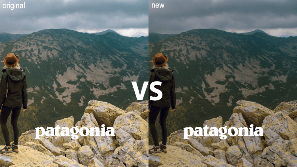
In the new ad to create contrast had to add a black layer with a very low opacity to make the image darker so that the text would be more readable. I felt like it didn’t take from the image because it made the sky seem like a dark overcast. In comparison to the original ad they added a more gradient layer to add contrast. However, in the new ad using a solid black layer went with the theme of the background image the best.
Design: Repetition
Just as the old ad did not have much repetition in it my ad didn’t either. But just as the old ad my fonts had a consistent white color.
Design: Alignment
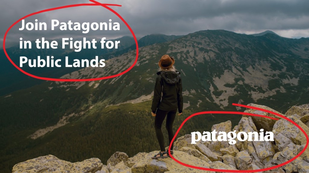
Just as the old I did my ad pulled both the text and logo to opposite corners to create proximity and alignment to opposite sides.
Design: Proximity
Just as the old ad did, I spaced my text and Logo exactly the same. I use the X & Y coordinates in Photoshop to position the logo and the text in the exact same position as the original ad.
Huge component of is the image as the focal point. The proximity and alignment of the text and logo make the supporting objects to the image rather than the focus.
Color
Color choice was pretty easy because the original design only used white for the text and logo.
Typography
The text was really easy to mimic as well because the Patagonia used Myriad Pro (Photoshop’s default font) or a font very similar. To get the sizing just right I used photoshop and created a text layer over the top of the top with the new text to match the size, line spacing, and font.
Conclusion
Patagonia has a design that is very simple and easy to mimic. The simple design of Patagonia’s ad design is to put emphasis on the photo rather than the text and the logo. Patagonia is an Outdoor Company and therefore the photo emphasizes people being outdoors. Then the heading put emphasis on Patagonia supporting public lands; narrowing the focus of the ad. Overall this is great simple design. Patagonia’s design is great example of use of contrast, proximity and alignment. As I mimicked Patagonia’s design principles, I was able to create an ad that looked a part of the original ad campaign.
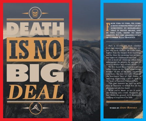
This magazine spread uses several different photography techniques such as Leading Lines, the Rule of Thirds, and Field of Depth. In addition, the designer uses intentional typefaces and contrasting typeface to create an exquisite design. Each of these techniques direct the eyes of the viewer, creates an aesthetically pleasing layout, and purposeful design. In the rest of this blog post I will analyze each of these techniques.
Leading Lines
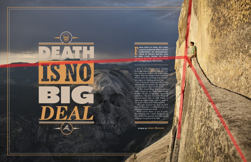
In the magazines spread the designer uses a photograph using the technique of Leading Lines.
“Leading lines refers to a technique of composition where the viewer of your photos attention is drawn to lines that lead to the main subject of the image.
A leading line paves an easy path for the eye to follow through different elements of a photo. Usually they start at the bottom of the frame and guide the eye upwards and inwards, from the foreground of the image to the background, typically leading toward the main subject.”
Anne McKinnell from digital-photography-school.com
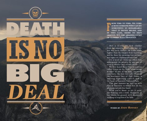
This case we can see that the designer uses the edge of the cliff as one line, the face of the cliff as another, and the mountain ridge in the background as another. As you can see with my annotated red lines in the picture above. This a point to many focus Alex Holland the Pro climber featured in this article.
Below you can see that I have recreated this but instead used the on the table and keyboard to point the hat. This technique is simple! Almost anything can be used as a leading line. Such as a road, railroad, telephone line. Try it!
Rule of Thirds
Next, I want to talk about a technique both used in photography and typography. This technique is called the Rule of Thirds.
The rule of thirds is an essential photography technique. It can be applied to any subject to improve the composition and balance of your images…
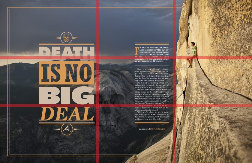
The rule of thirds involves mentally dividing up your image using 2 horizontal lines and 2 vertical lines, as shown below. You then position the important elements in your scene along those lines, or at the points where they meet…
The idea is that an off-centre composition is more pleasing to the eye and looks more natural than one where the subject is placed right in the middle of the frame. It also encourages you to make creative use of negative space, the empty areas around your subject.
Photographymad.com, Rule of Thirds
As you can see the photographer used the Rule of Thirds to position Alex Holland in the top right corner to create negative space and focus on Alex. This makes Alex the subject of the picture, creates balance, and excellent layout composition. Using this rule will improve the balance, composition, and focus in your designs. The see that designer has also placed the text in columns of thirds to create a composed design.
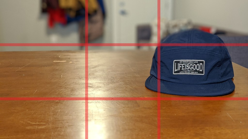
Below you can see that I have applied the same technique to the photo of my hat. I use the rule of thirds to place the patch of the hat in the far right center position. This creates negative space and a more interesting photo.
Depth of Field
In this next photography technique is Depth of Field. This technique is created by using focus and contrasting colors.
A basic definition of depth of field is: the zone of acceptable sharpness within a photo that will appear in focus. In every picture there is a certain area of your image in front of, and behind the subject that will appear in focus.
This zone will vary from photo to photo. Some images may have very small zones of focus which are called shallow depth of field.
“Understanding Depth of Field for Beginners” by Bruce Wunderlich, Digital-photography-school.com
To control the depth of field you need to your aperture and focal length. (to get more info see the article reference above.)
As you can see in the magazine spread above the photographer brought Alex Holland into focus because he is the subject. The photographer also makes the background mountain ridge dark and makes the cliff light to create shadows and highlights. Leaving the mountain in the shadows and the cliff in the highlights; this brings the focus onto Alex.
Below you can see that I have recreated this same effect by blurring out the background so that the hat is in focus.
Typefaces
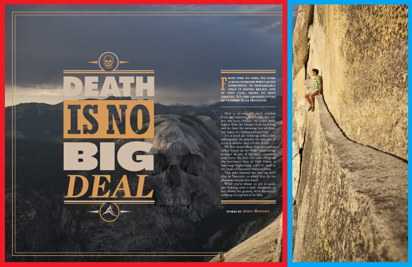
The designer is very intentionally with his typefaces in magazine spread. He uses a big bold font for the title “Death is No Big Deal ” to draw the reader’s attention. Then the leading lines lead to the subject Alex Holland and then to the small article in the blue block.
In seconds the designer has announced his title, identified the subject and the reader has started the article. This perfect example of using design and typefacess combined to direct the reader’s eyes.
Contrasting Typefaces
In addition the designer uses contrasting typefaces to indicate to the use that the big bold sans serifs font as the title and the small serifs as the article.
Conclusion
We can conclude that designers and photographers are very intentional in their technique. The photographer uses Depth of Field, Leading Lines, and the Rule of Thirds to draw attention to the subject, Alex Holland. The photographer uses the shadows of the mountains and the highlights of the cliff in addition to aperture and focal length to create Depth of Field. He uses leading lines & rule thirds to point to and focus on Alex. The designer captures the the Rule of Thirds by implementing his text into two of the three columns. In addition, he uses purposeful fonts to direct the reader’s eyes and establish the title and article. Each of these techniques are used intentionally to direct the reader’s eyes, establish focus and create the subject.